Start with what you want users to notice first.
Content features like this one are useful for a single call to action or to summarize related content and destinations.
A quote that supports the content right above can add some storytelling and social proof of what you're trying to say. These work best when they're one to two sentences, just enough to get the jist.

Person Lastname
Content creator
Cards are great on-page wayfinding tools.
Some destinations are best seen together with their own image and copy.
-
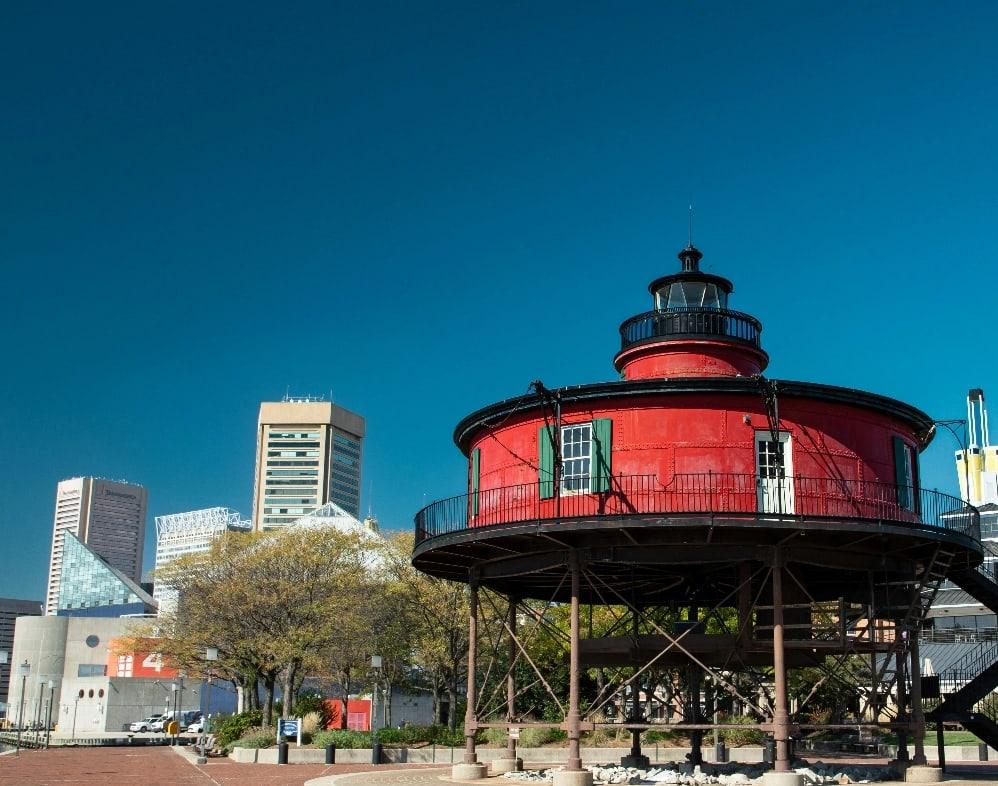
Each card is a single link
Yep, cards just link to one thing. You can also use the content feature if you want each column to have more than one link.
-

-
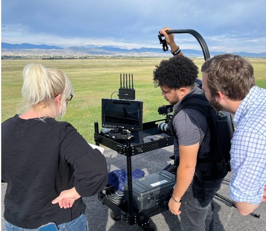
But try to use images for visual punch!
Images help users scan with more than just text. An easily recognizable image can make it easier to compare one card to another.